Website Trust Statistics: Design, Reviews & Contact (2026)
Website trust statistics from Revamp's internal analysis of 2,367 page ratings. Compare design, reviews and contact details, with methods and limitations.
Introduction
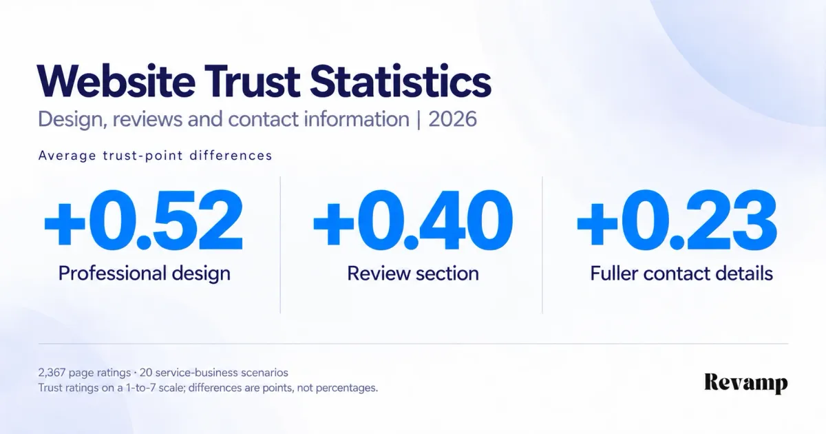
Professional-looking business pages averaged 0.52 more trust points than basic-looking pages on a seven-point scale. Pages showing reviews averaged 0.40 more points; fuller contact information corresponded to 0.23 more points.
These website trust statistics come from 2,367 page ratings covering 20 service-business scenarios, drawn from records for 600 participants. Eight page combinations let us compare presentation, reviews and contact information separately.
The business question is practical: when a website looks dated or unconvincing, should you change its design, add customer feedback or make the business easier to contact?
Scope: these are exploratory findings from Revamp’s internal dataset, not population estimates or conversion promises. The calculations are reproducible, but original collection and page-rendering records were unavailable for independent verification. See the methodology and limitations.
Key Takeaways
- Professional design: +0.52 trust points compared with basic design, with an estimated 95% interval of +0.38 to +0.67.
- Review section: +0.40 trust points compared with no reviews, with an estimated interval of +0.22 to +0.58.
- Fuller contact information: +0.23 trust points compared with email only, with an estimated interval of +0.07 to +0.39.
- All three together: average trust of 4.73/7, compared with 3.57/7 for basic design without reviews and with email-only contact.
- Trust is not conversion: 185 enquiry-button clicks were recorded, but the results did not establish a reliable click increase or measure completed enquiries.
- Reviews are not a proven substitute for design: the comparison between basic pages with reviews and professional pages without them remained inconclusive.
Explore the findings
- Design and trust
- Reviews and trust
- Contact information
- All eight page combinations
- Intentions and clicks
- Practical implications
- Methodology and sources
1. Professional-looking pages averaged 0.52 more trust points
Professional presentation had the largest estimated trust difference of the three changes. Each estimate compares pages with matching settings for the other two elements, then averages those comparisons.
| Page element changed | Average trust difference | Estimated 95% interval |
|---|---|---|
| Basic to professional design | +0.52 points | +0.38 to +0.67 |
| No reviews to review section | +0.40 points | +0.22 to +0.58 |
| Email only to fuller contact details | +0.23 points | +0.07 to +0.39 |
Read the numbers as rating points, not percentages. A 0.52-point difference does not mean 52% more visitors trusted the page. Design’s estimate is largest, but this analysis does not establish that its influence is statistically greater than reviews’.
The professional version combined clearer typography, spacing, imagery, hierarchy, service cards and button styling. The basic version was functional but plain and dated-looking. This is a comparison of whole presentations, not evidence for one font, color or photograph.
For a redesign, review the whole presentation rather than changing a button color and expecting the same difference. Check whether the page makes the business, offer and next step clear. Our separate website first-impression statistics examine whether people understand the offer, a different question from whether they trust it.
2. Pages with reviews averaged 0.40 more trust points
Pages with a review section scored higher for trust under both design conditions. Could reviews also make up for a dated-looking page? The more detailed comparisons leave that question open.
| Review comparison | Average trust difference | Estimated 95% interval |
|---|---|---|
| Reviews versus none, basic design | +0.52 points | +0.28 to +0.76 |
| Reviews versus none, professional design | +0.28 points | +0.03 to +0.53 |
| Basic design with reviews versus professional design without reviews | -0.12 points | -0.36 to +0.11 |
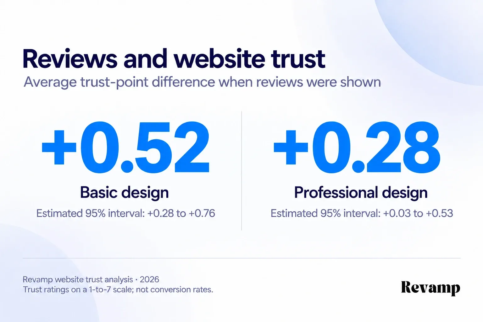
Basic pages with reviews averaged 0.12 fewer trust points than professional pages without reviews. The estimated interval spans both negative and positive differences, so it does not establish a winner or prove equivalence.
The review section showed a 4.7/5 rating, 63 reviews, four positive review cards and a verified-customer note. The review content was prepared for the research, not collected from actual customers. The comparison covers that whole review presentation, not the separate value of stars or review counts.
For a live website, use genuine feedback with clear attribution. Baymard’s research on reviews on direct-to-consumer sites documents skepticism toward merchant-hosted reviews. Although that is a different setting, it illustrates why displaying feedback and making it credible are separate jobs.
3. Fuller contact information corresponded to 0.23 more trust points
Pages with fuller contact information scored higher for trust and stated willingness to contact the business than pages showing email only.
| Outcome | Average difference | Estimated 95% interval |
|---|---|---|
| Perceived trust, 1 to 7 | +0.23 points | +0.07 to +0.39 |
| Stated contact intention, 1 to 7 | +0.15 points | +0.01 to +0.29 |
| Research-environment click rate | +1.92 percentage points | -1.63 to +5.51 |
The fuller section showed email, a local telephone number, a street address and opening hours. We cannot separate the contribution of each detail.
Make it easy to check how and when your business can be reached. Use accurate details rather than inventing an office or local presence. The click results do not establish that adding contact information increases enquiries.
4. The complete combination averaged 4.73 out of 7 for trust
Professional design with reviews and fuller contact details had the highest average trust rating: 4.73/7. Basic design without reviews and with email-only contact averaged 3.57/7. Here are all eight combinations, not just the strongest and weakest.
| Design | Reviews | Contact section | Ratings | Mean trust, 1 to 7 | Mean contact intention, 1 to 7 |
|---|---|---|---|---|---|
| Basic | None | Email only | 295 | 3.57 | 3.68 |
| Basic | None | Full details | 295 | 3.80 | 3.85 |
| Basic | Shown | Email only | 295 | 4.09 | 3.93 |
| Basic | Shown | Full details | 299 | 4.32 | 4.10 |
| Professional | None | Email only | 297 | 4.24 | 4.06 |
| Professional | None | Full details | 293 | 4.43 | 4.21 |
| Professional | Shown | Email only | 295 | 4.48 | 4.31 |
| Professional | Shown | Full details | 298 | 4.73 | 4.42 |
| Total | 2,367 |
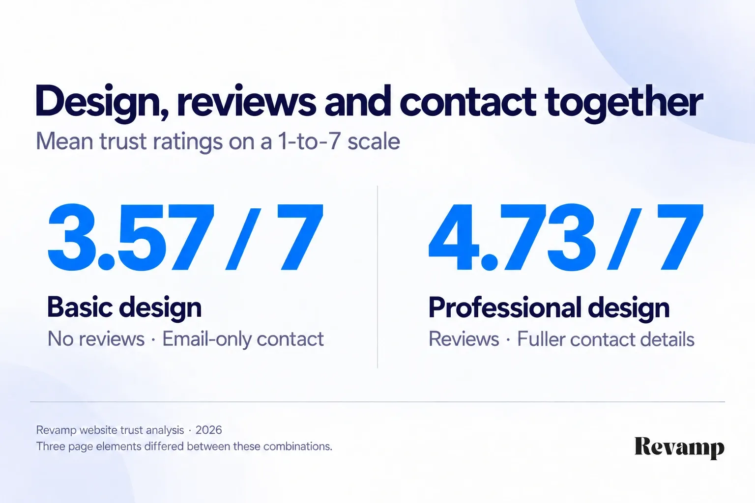
The difference between those endpoints was 1.17 points, with an estimated interval of +0.84 to +1.48. It cannot be attributed to design alone because all three elements changed.
The useful takeaway is to review presentation, evidence and reachability together. The results do not prove a special combined multiplier or that these three elements are sufficient for every business. See the combined-effects checks.
5. Higher trust ratings did not establish more enquiries
Willingness to contact the business was higher for each of the three changes. Actual enquiry-button clicks were less conclusive.
| Changed element | Contact-intention difference, 1 to 7 | Estimated 95% interval | Click-rate difference | Estimated 95% interval |
|---|---|---|---|---|
| Design | +0.36 points | +0.20 to +0.52 | +2.97 percentage points | -0.65 to +6.67 |
| Reviews | +0.24 points | +0.07 to +0.40 | +0.70 percentage points | -2.68 to +4.14 |
| Contact details | +0.15 points | +0.01 to +0.29 | +1.92 percentage points | -1.63 to +5.51 |
The dataset records 185 enquiry-button clicks across 2,367 exposures, or 7.8%. The rates varied across page combinations.
| Design | Reviews | Contact section | Clicks / exposures | Click rate |
|---|---|---|---|---|
| Basic | None | Email only | 18 / 295 | 6.1% |
| Basic | None | Full details | 13 / 295 | 4.4% |
| Basic | Shown | Email only | 17 / 295 | 5.8% |
| Basic | Shown | Full details | 27 / 299 | 9.0% |
| Professional | None | Email only | 28 / 297 | 9.4% |
| Professional | None | Full details | 29 / 293 | 9.9% |
| Professional | Shown | Email only | 18 / 295 | 6.1% |
| Professional | Shown | Full details | 35 / 298 | 11.7% |
The pattern was not consistently upward. Professional pages with reviews and email-only contact had fewer clicks than their no-reviews counterpart. Every estimated average click-difference interval includes zero, so these results do not establish a reliable increase.
A button click is not a submitted enquiry, booking or sale. Assess a live redesign using completed business journeys, not trust scores alone. Our mobile and desktop usability benchmarks likewise distinguish preparing an enquiry from submitting one.
What these website trust statistics mean for a business website
A redesign review should ask three different questions: does the page look professional, does it offer believable evidence, and can someone reach the business?
- Review the presentation as a whole. On your main service page, check the offer, readable text, visual hierarchy and next step. A fresh theme alone does not answer those questions.
- Make customer evidence specific. Use genuine feedback that helps someone assess the service. Attribute it accurately and keep ratings and counts current.
- Remove uncertainty about contacting you. Show legitimate contact options and availability. Keep those details consistent across the service page, contact page and footer.
Then walk through the journey yourself. Send an enquiry, book an appointment or complete the action your page asks visitors to take. Check that confirmation arrives and the business receives the request.
These are practical review steps, not a formula for reproducing the observed scores. A convincing page and a working customer journey need separate checks.
Methodology and Sources
The tables report exploratory comparisons within Revamp’s internal dataset. The checks below explain how the figures were calculated and where the evidence stops.
Combined-effects checks
We checked whether the difference associated with one element changed depending on another. For example, did reviews correspond to a larger trust difference on basic pages than on professional pages?
| Trust interaction | Estimated difference of differences | Estimated 95% interval |
|---|---|---|
| Design × reviews | -0.25 points | -0.59 to +0.09 |
| Design × contact | -0.02 points | -0.38 to +0.34 |
| Reviews × contact | +0.03 points | -0.30 to +0.36 |
| Design × reviews × contact | +0.06 points | -0.64 to +0.73 |
The two-way comparisons average over the third element. The three-way comparison checks whether the design-by-reviews difference changes between contact conditions. Every interval includes zero: neither a compensating effect nor a special combined multiplier was established.
Sensitivity checks
We corrected inclusion flags that did not match the documented rules, then compared the results with the original flag filter and with all recorded exposures.
| Analysis set | Page ratings | Design difference | Reviews difference | Contact difference |
|---|---|---|---|---|
| Corrected documented-rule analysis | 2,367 | +0.52 | +0.40 | +0.23 |
| Original supplied flag filter | 2,283 | +0.52 | +0.39 | +0.22 |
| All exposures retained | 2,400 | +0.53 | +0.40 | +0.23 |
The trust differences were similar across all three sets. That checks their stability under these inclusion rules, not the authenticity or representativeness of the original collection.
Dataset and scope
This October 2026 reanalysis uses records with reported collection dates of April 13 to May 1, 2026. A separate pilot of 60 participant records and 240 exposures is not included.
| Dataset characteristic | Corrected analysis |
|---|---|
| Main participant records | 600 |
| Raw page exposures | 2,400, four per participant |
| Excluded exposures | 33 failed attention checks |
| Retained page ratings | 2,367 |
| Service-business scenarios | 20, five in each service category |
| Categories | Accounting, consulting, legal services, home improvement |
| Device exposure mix | 1,243 mobile; 1,124 desktop |
| Primary outcome | Perceived trust, 1 to 7 |
| Secondary outcomes | Contact intention, 1 to 7; enquiry-button click |
Each participant record contains four different business pages. The specification describes randomized presentation of eight combinations of three two-option elements, a 2 × 2 × 2 factorial design. NIST explains this comparison structure. Record consistency does not independently verify that recruitment, assignment or presentation occurred as specified.
Data correction
The original flags excluded 117 exposures, not the 128 stated in the supplied summary. Two exclusion rules required a session median below five seconds, but the lowest recorded median was 9.5 seconds. Reapplying those rules left only the 33 failed attention checks to exclude, retaining 2,367 ratings.
Three individual exposures lasted less than five seconds; that was not the documented session-level cutoff. Raw observations and original flags remain unchanged. Corrected flags and reproducible calculations are preserved separately in the internal archive.
Calculations and uncertainty
The eight page scores are ordinary averages. Each main difference averages four matched comparisons, giving each combination equal weight. The review-by-design comparisons average over both contact settings. Calculations use unrounded values.
Because people rated multiple pages and businesses appeared repeatedly, we accounted for both sources of clustering. We independently resampled participant and business IDs 10,000 times, weighting each exposure by the product of their resampling counts. This follows Art Owen’s pigeonhole bootstrap approach, using random seed 20261004.
The estimated 95% intervals use the 2.5th and 97.5th percentiles of those resamples. An interval spanning zero leaves the direction of a difference uncertain. These approximate intervals apply to each comparison individually; they have no adjustment for multiple comparisons. With only 20 business examples, generalization remains limited.
These are unadjusted comparisons, not the original supplied mixed-model results. We make no confirmatory significance or verified statistical-power claim.
Revamp funded and analyzed this exploratory internal research. Original collection records were unavailable for independent verification. The findings describe the page conditions, not the performance of Revamp or all business websites. Trust questions preceded clicks, and equal page speed was not independently verified.
Frequently Asked Questions
How much does website design affect trust?
Professional-looking variants averaged 0.52 more trust points than basic-looking variants in this internal dataset, with an estimated interval of +0.38 to +0.67. The scale runs from 1 to 7; the difference is not a percentage of people.
Can customer reviews make up for poor website design?
The results do not establish that. Basic pages with reviews averaged 0.12 fewer trust points than professional pages without reviews, but the interval included zero. Neither option was established as superior, and equivalence was not proven.
Do more contact details increase website conversions?
Not established here. Fuller details corresponded to higher trust and stated willingness to make contact, but the click difference was uncertain. Completed enquiries and sales were not measured.
Build what your business needs. Keep improving it.
- Start with your existing website or create something new from your idea
- Add pages, forms, bookings, payments and other business features by chatting
- Publish on your own domain and keep improving everything in one workspace
More Guides
Website First-Impression Statistics: 500-Person Study (2026)
Revamp's 2026 five-second study of 500 US participants and 50 pre-redesign business homepages: business recognition, offer comprehension and CTA recall.
Mobile vs. Desktop Usability: Booking and Enquiry Benchmarks (2026)
Revamp’s 2026 booking and enquiry benchmarks: 4,584 mobile and desktop task attempts across 48 US service-business websites, with times and form errors.
Website Redesign Conversion Statistics: 22-Business Study (2026)
13.5% higher recorded conversion rates after redesign: website redesign conversion statistics from 496,781 visitors across 22 service businesses.